The Potential of Variable Fonts
Variable fonts have burst onto the design scene, promising flexibility, creativity, and a touch of magic to typography. But what exactly are they, and how can you make the most out of them? Let’s dive into the world of variable fonts, and provide you with high-quality insights to elevate your designs.
What are Variable Fonts? Variable fonts are like the Swiss Army knife of typography. Instead of having multiple font files for different styles (like bold, italic, light, etc.), you get one font file that includes all these variations and more. Think of it as a font file on steroids – one that can stretch, squeeze, tilt, and morph, all while maintaining its integrity.
Why Variable Fonts Matter Imagine you’re designing a website, and you want to keep the load times down while still offering a rich typographic experience. Variable fonts reduce the need for multiple font files, making your site faster and your job easier. Plus, they offer unparalleled creative control. Want your text to grow bolder on hover? Easy. Need a smooth transition from light to dark? Done.
Customization Tips for Dynamic Typography
Embrace the Flexibility: With variable fonts, you can fine-tune the weight, width, and slant of your text with precision. This means you can create responsive typography that adapts seamlessly to different screen sizes and orientations. No more static, one-size-fits-all typefaces. Now, your text can breathe and flow with your design.
Play with Transitions: One of the coolest features of variable fonts is their ability to animate. Imagine your text gradually transitioning from thin to thick as you scroll down a page. This can add a layer of interactivity and engagement to your design that static fonts simply can’t match. Here’s a quick CSS snippet to get you started:
“@font-face {
font-family: ‘YourVariableFont’;
src: url(‘YourVariableFont.woff2’) format(‘woff2-variations’);
font-weight: 100 900;}
h1 {
font-family: ‘YourVariableFont’, sans-serif;
font-variation-settings: ‘wght’ 100;
transition: font-variation-settings 0.5s;}
h1:hover {
font-variation-settings: ‘wght’ 900;}”
3. Optimize for Performance: While variable fonts are more efficient than multiple font files, they can still be hefty. Use only the axes you need (weight, width, etc.) and subset your fonts to include only the characters you use. This keeps your load times quick and your user experience smooth.
Examples of Variable Fonts in Action
Recursive: Recursive is a variable font that combines both mono and sans-serif styles in one font file. It’s perfect for developers and designers who need a versatile typeface that can switch from code to content without missing a beat.
Roboto Flex: Google’s Roboto Flex offers an impressive range of weights, widths, and optical sizes. It’s designed to be highly adaptable, making it a go-to choice for responsive web design. Whether you're working on a mobile app or a desktop site, Roboto Flex has you covered.
Amstelvar: Amstelvar is a superfamily of variable fonts that showcases the full potential of this technology. With multiple axes for weight, width, contrast, and even optical size, it’s a playground for typographers and designers looking to push the boundaries.
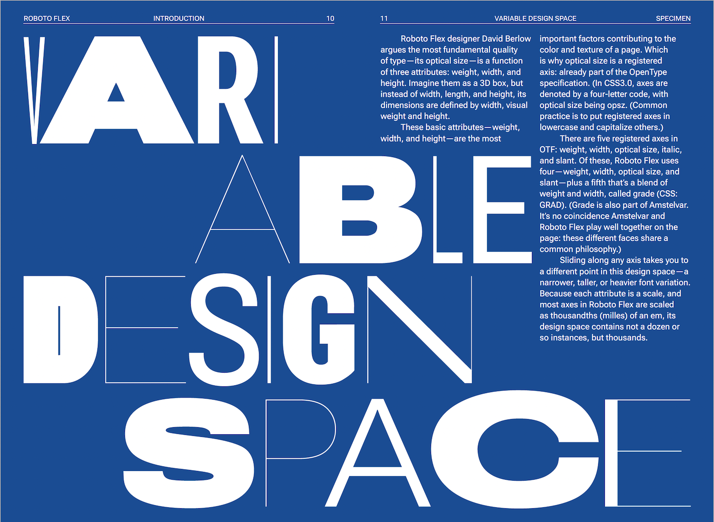
Roboto Flex Type Specimen | Image Source: © Chris does Content (24/05/24)
Practical Use Cases: Let’s look at a couple of practical scenarios where variable fonts shine.
Responsive Web Design: Imagine a blog where the headline’s weight changes based on the screen size. On a small mobile screen, it’s light and airy. On a desktop, it’s bold and eye-catching. This ensures optimal readability and aesthetic appeal across all devices.
Branding: Brands can use variable fonts to maintain a consistent yet flexible identity. For instance, a brand might have a sleek, thin logo for print and a bolder version for digital media, all from the same font file. This keeps the brand recognizable while adapting to different contexts.
If the thought of diving into the world of variable fonts has you excited but a bit overwhelmed, fear not! I’m here to help you navigate this typography revolution. From customizing your designs to optimizing performance, I’ve got you covered. Contact me!
Or head over to my shop where I offer a variety of resources, including Photoshop assets and mockups, to elevate your design projects. Let’s make your typography as dynamic and engaging as your brand deserves!