Designing for Dark Mode: Strategies for Creating Dark User Interfaces
Dark mode isn't just a trend; it's a revolution in UI design. It’s sleek, modern, and easy on the eyes, especially in low-light environments. But designing for dark mode requires a different approach than the traditional light UI. Let’s explore the strategies to create stunning dark UIs that are both functional and visually appealing.
Why Dark Mode? Dark mode reduces eye strain, saves battery life on OLED screens, and looks undeniably cool. However, it's not just about inverting colors. A successful dark UI requires thoughtful design to maintain readability, contrast, and aesthetic appeal. Let’s break down how you can master this art.
Contrast and Readability
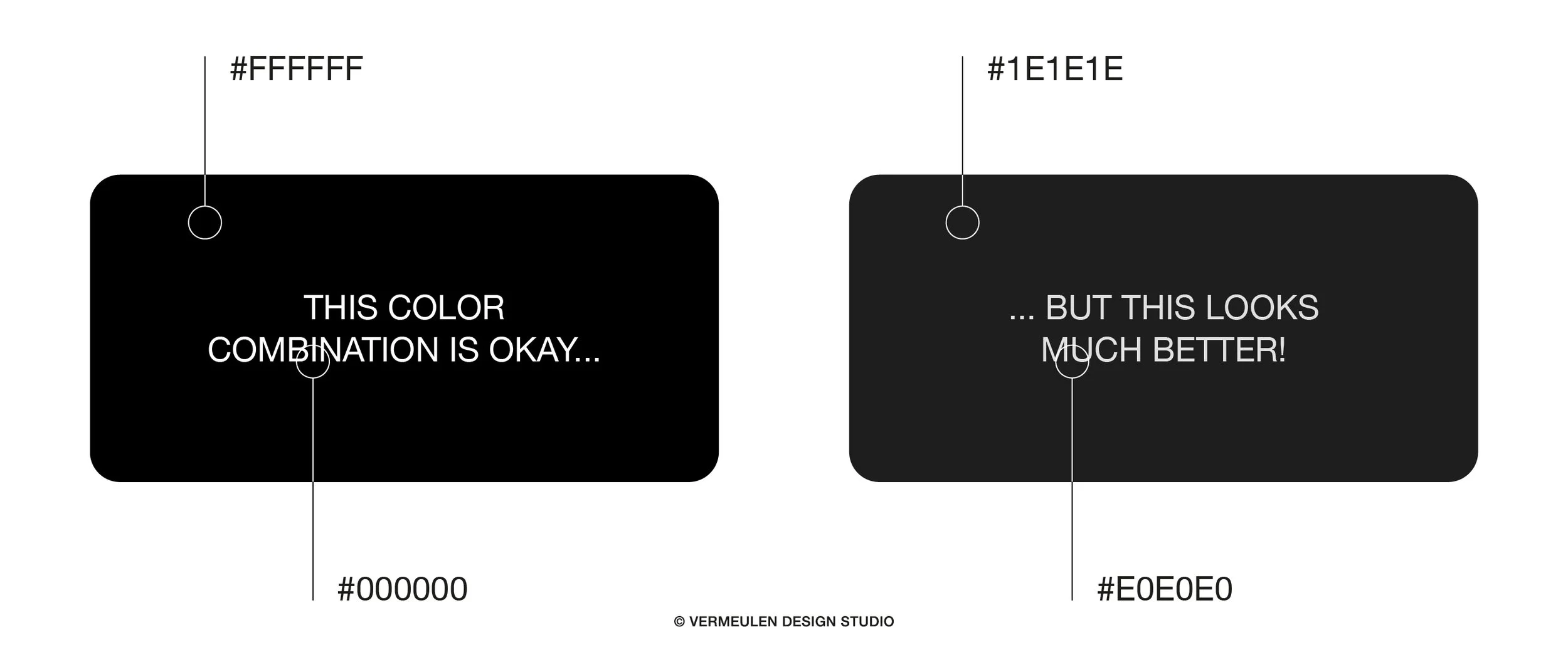
The first rule of dark mode design is maintaining sufficient contrast. Unlike light UIs, where black text on a white background is the norm, dark UIs use light text on dark backgrounds. This might seem straightforward, but achieving the right balance is crucial.
Text and Background: Ensure that there’s enough contrast between the text and background. A common mistake is using pure white text on a pure black background, which can cause eye strain. Instead, use off-whites and dark grays. For example, #E0E0E0 for text and #1E1E1E for the background offers a softer, more comfortable reading experience.
Color Accents: Bright colors can pop beautifully against dark backgrounds, but they can also be overwhelming if overused. Use color accents sparingly to highlight key elements like buttons, links, and icons. This not only maintains visual hierarchy but also directs the user’s attention to important actions.
Choosing the Right Colors
Dark mode gives you the opportunity to experiment with bold and vibrant colors. However, the key is subtlety and balance.
Primary Colors: When choosing primary colors, opt for shades that offer good visibility and contrast against dark backgrounds. For example, rich blues, deep purples, and emerald greens work well. These colors provide a striking contrast without being too harsh on the eyes.
Secondary Colors: Secondary colors should complement your primary colors without clashing. Use them for secondary actions, hover states, and other UI elements that need to stand out but not dominate.
Typography in Dark Mode
Typography plays a critical role in dark mode design. Since readability is paramount, your choice of fonts and their styling can make or break the user experience.
Font Weight: Thin fonts can disappear against dark backgrounds, while overly bold fonts can appear too heavy. Striking a balance is essential. Medium to semi-bold font weights often work best for body text, ensuring clarity without being overwhelming.
Line Spacing: Increased line spacing can improve readability in dark mode. The dark background can make text feel cramped, so slightly larger line heights help keep the text legible and comfortable to read.
Examples of Dark Mode Designs
Twitter: Twitter's dark mode, known as "Dim" and "Lights Out," offers users a choice between a dark blue-gray background and a true black background. The text color shifts to a light gray, providing a comfortable reading experience. The occasional use of Twitter’s blue for buttons and links helps maintain brand consistency while standing out against the dark UI.
Slack: Slack’s dark mode is a great example of using dark grays and accent colors to create a professional yet approachable interface. The subtle use of color for notifications and highlights ensures that important information stands out without being jarring.
Apple’s macOS: Apple’s implementation of dark mode in macOS is a masterclass in balancing functionality and aesthetics. The use of dark gray backgrounds, white text, and minimal color accents creates a cohesive and visually pleasing interface. Apple's careful attention to detail ensures that all UI elements are easy to read and interact with.
Designing for Both Light and Dark Modes
When designing for both light and dark modes, ensure that your design system is adaptable. This means creating components and assets that can seamlessly switch between modes without losing their visual integrity or usability.
Your brand’s colors and style should remain consistent across both modes. This might require tweaking your color palette to ensure it works well in both light and dark environments. Tools like Figma and Sketch offer ways to preview your designs in both modes, helping you fine-tune your choices.
Creating stunning dark UIs is an art that requires a thoughtful approach to contrast, color, and typography. By following these strategies, you can design dark mode interfaces that are not only visually appealing but also enhance the user experience.
Feeling overwhelmed? No worries! I can help you create beautiful, functional dark mode designs that your users will love. Check out my shop for resources that can elevate your design projects, and let’s get started on making your UI stand out.