Top Typography Trends of 2025
Fonts may not seem like a hot topic, but let’s be honest—bad typography is like wearing socks with sandals. Sure, you can do it, but should you? Probably not. On the flip side, great typography is one of the quiet powerhouses of effective design. It sets the tone, carries your voice, and can even (when done right) become the face of your brand. And in 2025, type is louder, bolder, and a little weirder—in all the right ways.
Typography trends are evolving fast, and designers are riding a fine line between timelessness and experimentation. This year’s fonts are no longer just letters on a screen—they’re characters with, well, character. Whether you're refreshing a brand identity or designing your next poster masterpiece, keeping an eye on what’s trending can be the difference between “meh” and “memorable.”
So let’s get into the thick of it—what’s happening in the world of typography this year, and how can you actually use it in your projects without it looking like a Pinterest board gone rogue?
What’s Driving Typography Trends Right Now?
The rise of AI-generated design, the saturation of minimalist branding, and the nostalgia economy are just a few reasons typography has taken a turn toward the bold, expressive, and nostalgic. In short, designers are craving fonts that do something—not just look clean or legible. Whether it's a chunky serif that screams editorial luxury or a squiggly sans that flirts with chaos, the fonts of today are designed to stand out. There’s also a rising demand for custom and semi-custom typefaces. Brands want to be remembered—and having a unique voice starts (literally) with the letters that spell out their name.
Key Typography Trends You Shouldn’t Sleep On
Let’s break down what’s showing up in branding, packaging, websites, and ad campaigns this year:
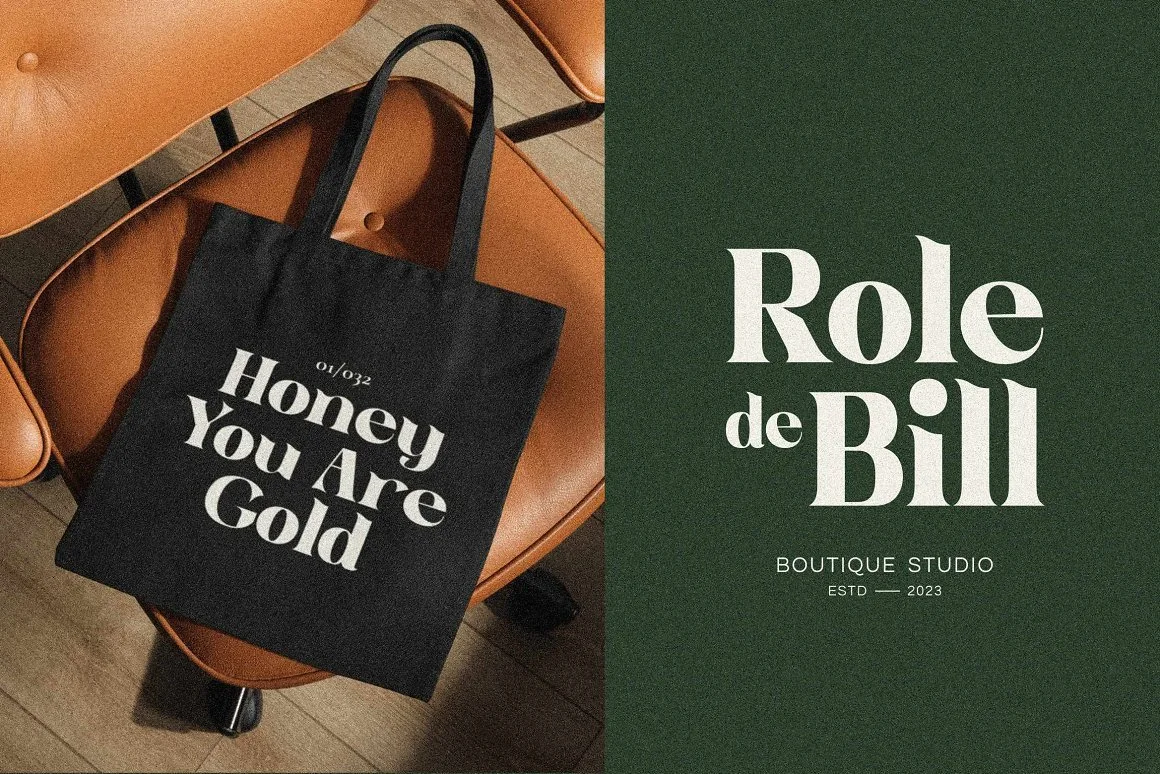
1. Superbold Serif Fonts: Big, confident serifs are everywhere—and no, they’re not your grandma’s Times New Roman. These new-age serifs are exaggerated, editorial, and full of drama. They carry presence and elegance but don’t take themselves too seriously. Perfect for premium brands or anyone trying to say, “Hey, I’ve got something to say, and I’m going to say it in a really great font.”
Bolle Roteid Font by Fype Co. | Image Source: Behance/Fype Co. (11/04/25)
2. Grotesque Sans, But With a Twist: The clean, geometric sans serif isn’t going away—but now it’s got personality. Designers are adding quirky curves, uneven baselines, and unconventional letterforms to give modern sans types a little more soul. Think Helvetica after two espresso shots and a weekend in Berlin.
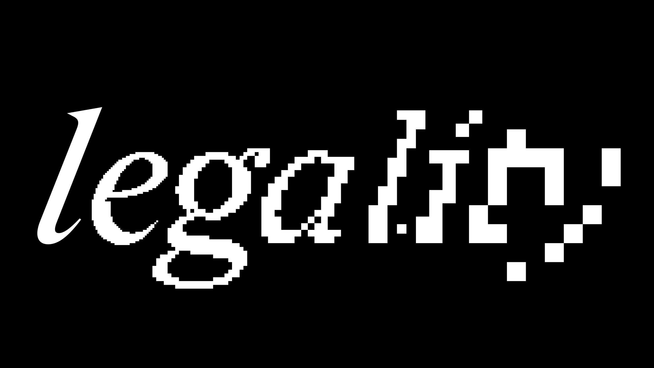
3. Pixel & Tech-Inspired Fonts: Retro-futurism is booming—especially in the tech and gaming scenes. Think pixel fonts, monospaced characters, and lettering that feels pulled from a 1998 operating system. Perfect for digital-first brands or anyone trying to vibe with the Y2K revival.
Amstir Pixel font by Craft Supply Co. | Image Source: ©2025 Craft Supply Co. (11/04/25)
4. Handwritten & Scribbled Fonts: Authenticity is in high demand, and there’s nothing quite as human as a little mess. Handwritten fonts—ranging from neat script to casual doodles—bring warmth and individuality to brand communication. Especially popular in skincare, lifestyle, and indie food brands.
5. Variable Fonts and Fluid Typography: The future is flexible. Variable fonts are designed to morph based on device, screen size, or user behavior. Think stretchy, fluid letterforms that respond to your scrolling. It’s interactive typography—and yes, it’s as cool as it sounds.
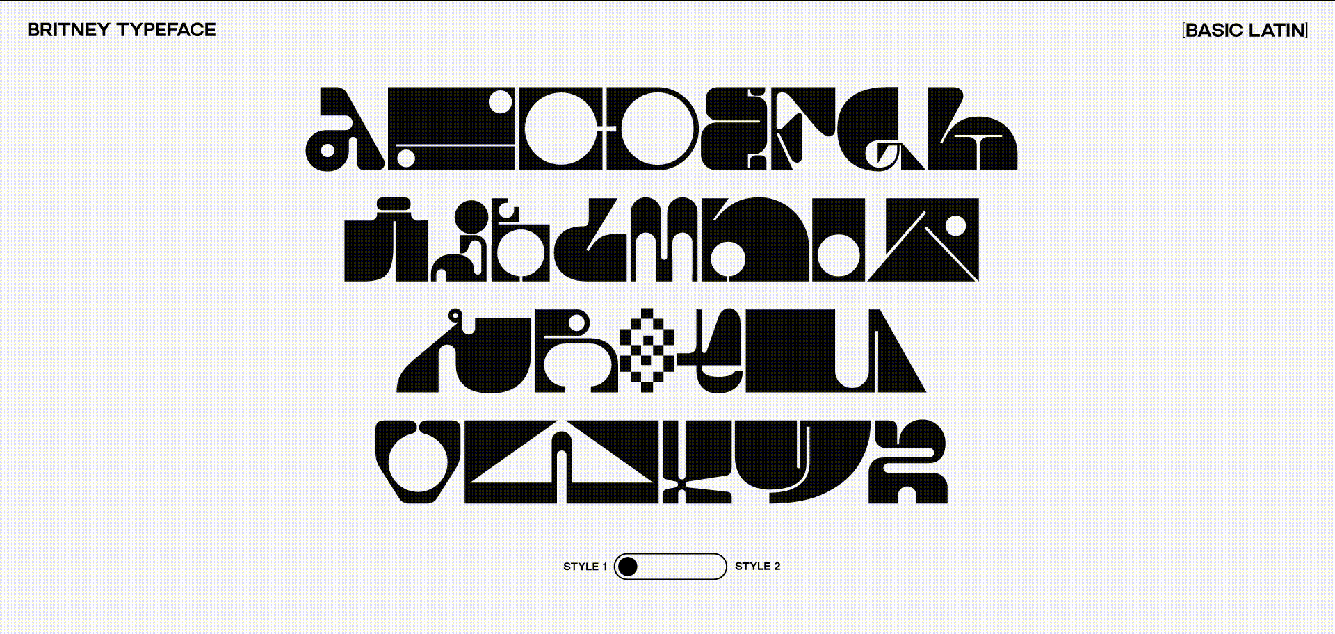
Britney Super Mega Display Variable Font by Clément Cases | Image Source: Behance/Clément Cases (11/04/25)
Fonts That Are Stealing the Spotlight in 2025
Here are a few fonts you’ll see popping up everywhere from trend-forward branding to packaging design. These are the ones making designers pause mid-scroll and say, “Wait, what font is that?”
Canela – A modern serif with an editorial flair. Elegant but packs a punch.
Neue Montreal – A grotesque sans with just the right amount of funk.
Redaction – A font born from protest. Raw, loud, and unapologetically powerful.
Pilar – Dramatic strokes, retro vibes, and a killer display presence.
Recoleta – Soft, nostalgic, and basically a warm hug in font form.
Redaction font in use by Jeremy Mickel and Forest Young | Image Source: © AIGA/Meg Miller (11/04/25)
And yes, many of these are available on platforms like Adobe Fonts or Google Fonts, but some live in boutique font foundries that deserve a bit of spotlight too. (Support your local typographers, folks.)
How to Use Trending Fonts Without Looking Trendy (in the Bad Way)
Trends are great until every designer on the planet jumps on them and suddenly your edgy typeface shows up on toothpaste packaging and fintech ads. So how do you make trends work for you without becoming design wallpaper?
The key is intention. Pair trendy fonts with timeless ones. Use bold styles sparingly to create visual hierarchy. And most importantly, match the font’s personality with your brand’s voice. Just because something looks cool doesn’t mean it makes sense for your message. A rebellious typeface might look killer, but will it still work when you’re writing a customer service email?
Typography is about communication, after all. Form should never overshadow function—but when the two play nicely together, magic happens.
Fonts Matter—Probably More Than You Think
Typography might not always scream for attention (unless you really want it to), but it quietly shapes how people feel about your brand before they’ve even read a single word. It’s not just decoration—it’s identity. In 2025, the font landscape is louder, bolder, and more expressive than ever—and that’s exactly why great typography can set your design lightyears ahead of the competition.
If your brand’s voice deserves a visual identity that actually feels like you, let’s talk. I create custom branding and design solutions that go beyond the basics—no cookie-cutter fonts or generic templates here. And if you're not quite ready to hire a designer, I've also got a few DIY-friendly kits in my shop to help you elevate your design game without breaking the bank. Either way, you’ll leave with something that looks sharp, feels right, and works beautifully.