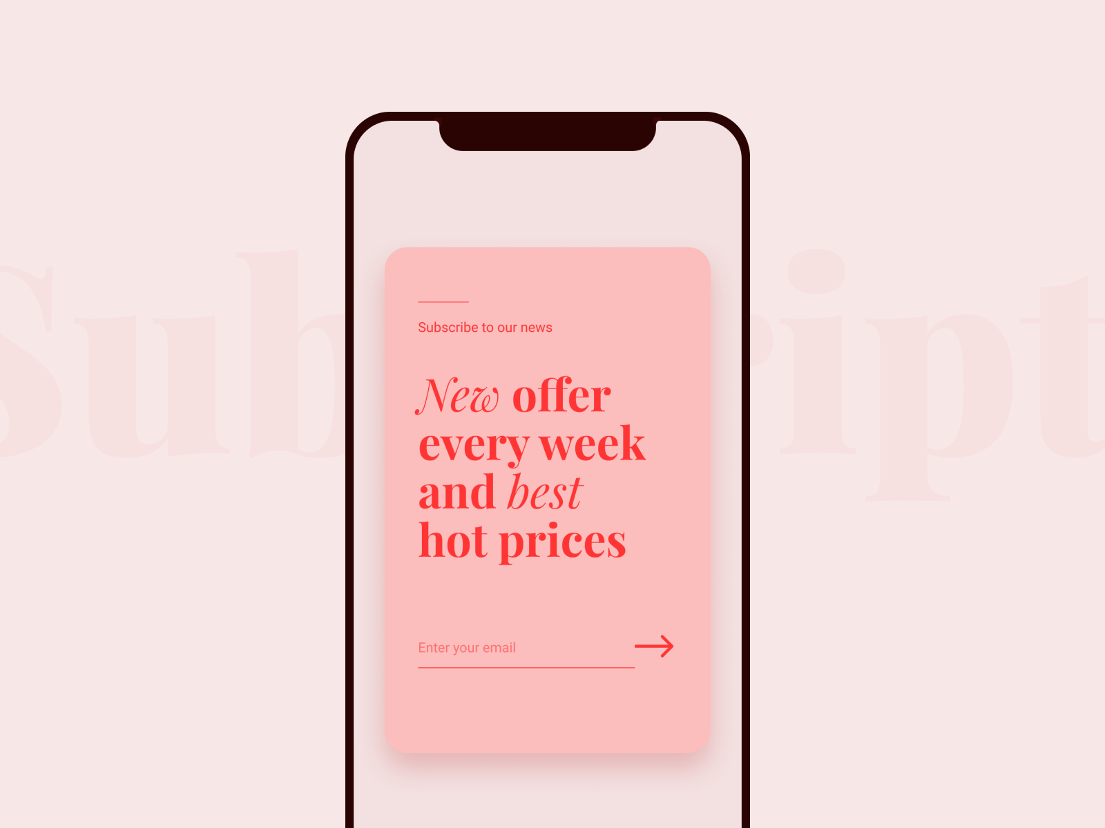
Pop-Up Ads Done Right: Crafting Engaging Designs Without Annoying Users
Pop-up ads: we all know them, and most of us have probably been irritated by them at some point. But when done right, they can be highly effective tools for capturing attention and driving action. The secret lies in balancing aesthetics with functionality—creating ads that not only look good but also serve their purpose without being intrusive or annoying. So how do you walk this fine line? Let’s break it down.
Why Pop-Up Ads Are Still Relevant: Despite the bad reputation they sometimes carry, pop-up ads remain one of the most effective digital marketing tools. Studies have shown they can increase conversion rates by up to 9.28%—impressive, right? Whether you're promoting a special offer, encouraging newsletter signups, or gathering leads, pop-ups get people to take action. However, this doesn’t mean throwing any pop-up on your website will do the trick. The key is in how they’re designed, both in terms of looks and usability.
Tip #1: Timing Is Everything
Nobody likes a pop-up ad that appears the second you land on a website. It’s like walking into a store and being bombarded by a salesperson before you’ve even looked around. Instead, give your visitors a little time to engage with your content. Trigger the pop-up after they've scrolled through at least 50-70% of the page or after a set amount of time, like 30 seconds. This way, they won’t feel ambushed and are more likely to engage.
Example: Imagine you’re on an online clothing store, scrolling through their new arrivals. After 30 seconds, a tasteful pop-up appears, offering a 10% discount if you subscribe to the newsletter. It feels like a reward, not a distraction.
Tip #2: Make It Easy to Close
If users can’t find the close button or, even worse, the ad doesn’t close at all, congratulations—you’ve just lost a potential customer. Always provide a clearly visible exit option. If you’re concerned about losing conversions, you can get creative with the copy on the close button. Instead of just "X" or "No, thanks," try phrases like, "No, I’ll pass on the 20% discount." This keeps things lighthearted and makes the user pause for a moment.
Tip #3: Minimalism Is Your Friend
Less is more when it comes to designing pop-up ads. Keep your message short and clear. Overcrowded pop-ups with too many images, buttons, or text can overwhelm users. Stick to a clean design with a single call-to-action (CTA). Use contrasting colors to make your CTA button stand out, but avoid using too many colors and fonts, as it can make your pop-up look messy.
Example: A well-designed pop-up for a fitness blog could feature a simple message: "Get our FREE 7-day workout plan! Enter your email below." A sleek background with just the right amount of white space ensures the message and the CTA are the focus.
Tip #4: Personalize Your Pop-Up Ads
Personalization goes a long way in making pop-up ads more appealing. By tailoring the message to the individual, you can significantly increase engagement. Use data such as the user’s location, language, or past behavior on your site to craft a pop-up that feels relevant to them.
Example: If someone has been looking at hiking gear on your e-commerce site, you could show them a pop-up offering a discount on hiking boots. They’ll appreciate that the offer is specifically relevant to their interests rather than a generic ad.
Daily UI 016: Pop-up / Overlay by Cindy Wang | Image Source: Dribbble/Cindy Wang (06/09/24)
Tip #5: Don't Be Intrusive
Pop-ups that obscure the entire screen or have multiple layers of distractions scream, "Please leave my website!" Instead, aim for subtlety. A small slide-in pop-up from the bottom corner of the screen can be just as effective without frustrating your users.
Example: A subscription pop-up that slides in from the right-hand side, covering only a small portion of the screen, can grab attention without disrupting the user's browsing experience.
Balancing Design and Functionality: It’s important to strike a balance between aesthetics and functionality when designing pop-ups. A well-designed ad will naturally flow with your site’s overall look and feel, while still standing out enough to grab attention.
Font Choices: Use easy-to-read fonts that match your brand’s personality. Avoid anything overly decorative that could make your message hard to read.
Color Palette: Stick with your brand’s color palette, but ensure there’s enough contrast between the background and the text for easy readability.
Imagery: Use high-quality images or graphics, but make sure they don’t overpower the CTA or message. The focus should always remain on what action you want the user to take.
Pop-up / Overlay by Anna Lazareva | Image Source: Dribbble/Anna Lazareva (06/09/24)
Designing pop-up ads doesn’t have to be an intrusive experience for your users. In fact, when done right, pop-ups can enhance the user experience by providing timely, relevant offers or information. The key is to find the sweet spot between eye-catching design and subtle functionality. Focus on clear messaging, user-friendly design, and personalization to create ads that convert without annoying your visitors.
Pop-ups might get a bad rap, but if you take the time to design them thoughtfully, they can be an essential tool in your digital marketing toolkit. So, go ahead—experiment with different layouts, timings, and offers, and you’ll soon discover just how powerful these little windows of opportunity can be.
If you're looking for professional guidance or a custom solution to enhance your website's engagement through well-designed, effective pop-up ads, I can help. With my expertise in graphic and web design, I create tailored pop-up ads that align with your brand, grab attention, and improve conversions without compromising the user experience. Reach out today, and let's take your pop-up strategy to the next level!


