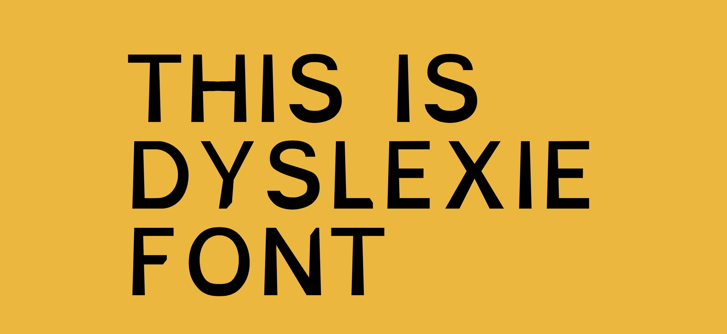
How to Create Dyslexia-Friendly Fonts for Better Reading
Design is not just about aesthetics; it's about communication. When it comes to designing for people with dyslexia, the need for clarity, legibility, and accessibility becomes paramount. Dyslexia, a learning disorder affecting reading, can make traditional fonts challenging to navigate. As a designer, creating dyslexia-friendly fonts is an opportunity to ensure that your work is inclusive, allowing everyone to engage with your content without unnecessary barriers. In this article, we’ll dive into the principles and techniques behind designing fonts specifically tailored for readability by individuals with dyslexia, making your designs not just beautiful but accessible to all.
Understanding Dyslexia and Its Impact on Reading
Before jumping into font design, it's crucial to understand how dyslexia affects reading. Dyslexia is a neurological condition that impairs the ability to recognize and process written language. This can manifest as difficulties with word recognition, spelling, and decoding words. For someone with dyslexia, letters can appear to jump around, words can blend together, and reading can become a tiring, frustrating experience.
This is where dyslexia-friendly fonts come into play. By addressing the specific challenges faced by individuals with dyslexia, designers can create typefaces that are easier to read, reducing the cognitive load and improving the overall reading experience.
Principles of Designing Dyslexia-Friendly Fonts
So, what makes a font dyslexia-friendly? Here are some key principles:
Character Distinction: In dyslexia-friendly fonts, each letter needs to have a unique shape to prevent confusion. For example, letters like 'b' and 'd' or 'p' and 'q' are easily confused in traditional fonts because they are mirror images of each other. In a dyslexia-friendly font, these letters should have distinct features that make them easily distinguishable.
Weight and Spacing: The weight (thickness) of a font plays a crucial role in its readability. Dyslexia-friendly fonts often have a slightly heavier base, making them more anchored and less likely to blend together. Adequate spacing between letters (kerning) and between lines (leading) is also important, as it helps prevent letters from crowding each other and words from merging together.
Avoiding Ambiguous Shapes: Some letters in the alphabet have similar shapes that can be easily confused. For instance, the lowercase 'l' and uppercase 'I' can look almost identical in many fonts. Designing with distinct shapes for these characters can make a world of difference for dyslexic readers.
Consistency: Consistency in letterform is another important aspect. This means that similar letters, such as 'o' and 'c', should be designed in a way that maintains a consistent visual style, helping the reader to quickly recognize and differentiate them.
Techniques for Designing Dyslexia-Friendly Fonts
Now that we’ve covered the principles, let’s look at some techniques you can use to design fonts that are not only aesthetically pleasing but also accessible to dyslexic readers.
Use Open Forms: Open forms refer to letters that have larger openings, like in the letters 'c', 'e', and 's'. By enlarging these openings, you can create a font that is more readable and less likely to be misinterpreted by dyslexic readers.
Focus on the Baseline: The baseline is the invisible line on which letters sit. In dyslexia-friendly fonts, letters often have a heavier bottom weight, which helps anchor them to the baseline. This gives the text a stable, grounded feel, reducing the tendency of letters to “float” or rotate in the reader’s mind.
Play with Ascenders and Descenders: Ascenders (the parts of letters that extend above the x-height, like in 'h' or 'l') and descenders (the parts that extend below the baseline, like in 'g' or 'y') should be slightly exaggerated. This helps in creating a strong visual difference between letters, making them easier to recognize.
Avoid Decorative Fonts: While decorative and script fonts may look fancy, they are often difficult to read, especially for individuals with dyslexia. Stick to sans-serif fonts with simple, clean lines. This doesn’t mean your font has to be boring, though; creativity within these constraints can lead to some truly unique and functional designs.
Dyslexie Font Design Basics | Image Source: Dyslexie Font (30/08/24)
Examples of Dyslexia-Friendly Fonts
If you're looking for some inspiration or ready-made examples, here are a few dyslexia-friendly fonts that have been specifically designed with accessibility in mind:
Dyslexie Font: Created by Christian Boer, who has dyslexia himself, Dyslexie Font is one of the most well-known dyslexia-friendly fonts. It uses heavy baselines, enlarged openings, and distinct letter shapes to enhance readability.
Dyslexie Font by Christian Boer | Image Source: Dyslexie Font (30/08/24)
OpenDyslexic: OpenDyslexic is an open-source font designed to improve readability for dyslexic readers. It features weighted bottoms and distinct shapes for similar letters, making it a popular choice for accessible design.
OpenDyslexic Font by Abelardo Gonzales | Image Source: Wikipedia/OpenDyslexic (30/08/24)
Lexend: Lexend focuses on improving reading fluency by using variable fonts that adjust letter spacing and size. This flexibility allows designers to tailor the reading experience to individual needs.
Comparison between Helvetica and Lexend | Image Source: © slanted publishers 2024 (30/08/24)
Designing dyslexia-friendly fonts isn’t just about ticking off a checklist of principles and techniques; it’s about empathy. By understanding the challenges faced by dyslexic readers and taking steps to make your designs more inclusive, you’re not just creating a font—you’re making a difference in how people interact with the written word.
Incorporating these principles into your design process can elevate your work, making it not only more functional but also more meaningful. If you're ready to start designing with accessibility in mind, consider how you can integrate these practices into your next project.
And if you want to ensure your project is accessible to all, feel free to reach out to me. Let’s create something that truly speaks to everyone.


