Retro, But Make It Modern
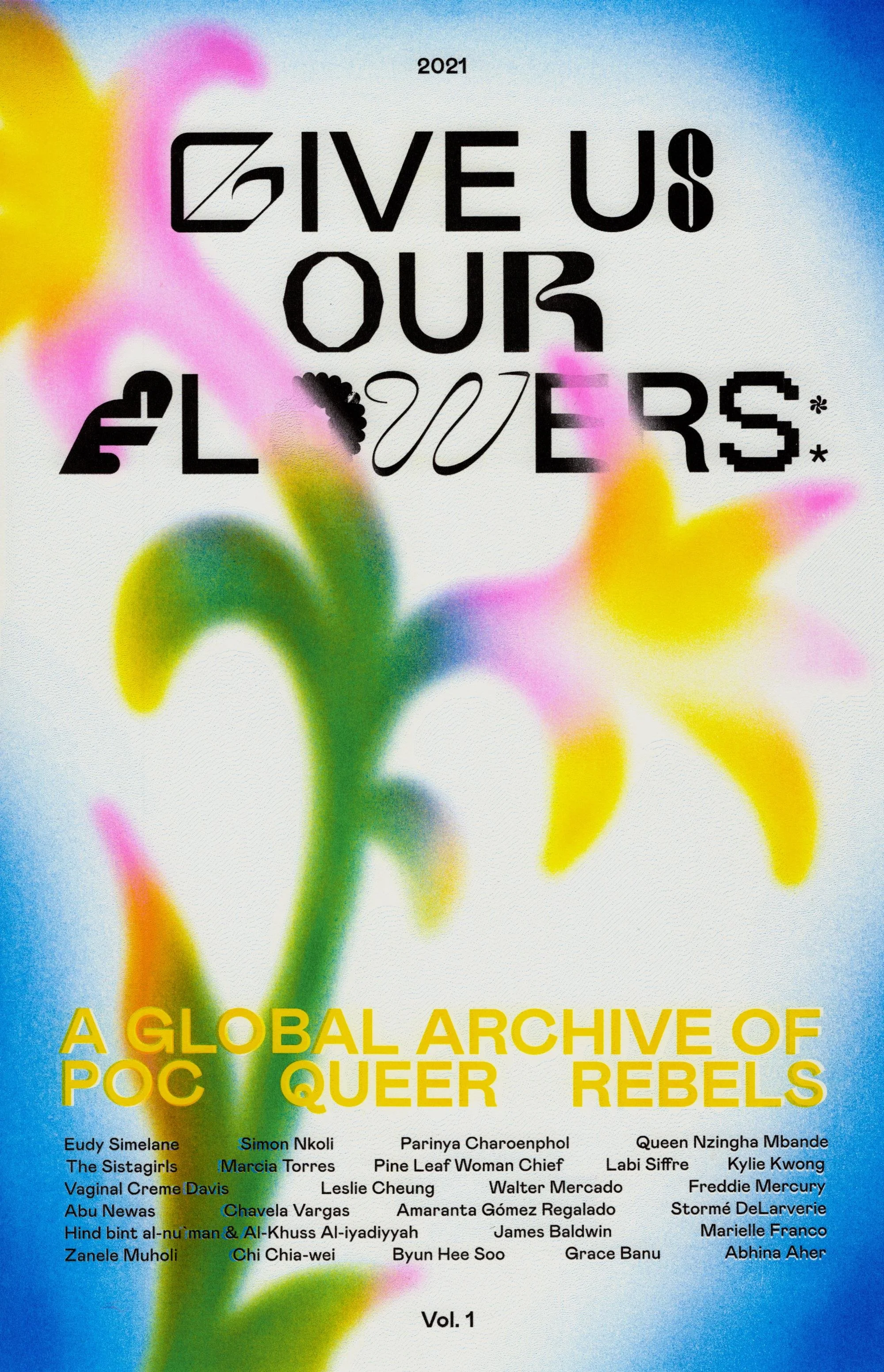
Give Us Our Flowers by BUCK via Secret Riso Club | Image Source: Secret Riso Club (25/04/25)
Vintage design isn’t just a passing trend—it’s a visual love letter to decades past. From bold typography inspired by the 1970s to grainy textures reminiscent of 1940s print ads, retro design elements have made a serious comeback. But it’s not about slapping a sepia filter on everything and calling it a day. When used with intention, vintage aesthetics can add a rich sense of character and emotional depth to modern projects without feeling outdated or gimmicky.
So, what’s driving this nostalgia-powered design wave? Why are so many creatives reaching for halftones, serif fonts, and color palettes that look like they walked straight out of a diner menu in 1962? Let’s take a closer look—and talk about how to actually do it well.
Why Vintage Design Is Back in Style (Again)
Design, much like fashion, operates in cycles. Every few years, we see a renewed appreciation for past styles, as a form of rebellion against the dominant visual language of the moment. In an age where sleek minimalism and futuristic tech visuals have saturated every platform, vintage design offers a refreshing alternative. It’s warm. It’s human. It reminds us of tactile things—vinyl records, old signage, matchbox art, hand-lettered menus.
There’s also a deeper emotional component. Retro visuals have a way of triggering nostalgia—even if you didn’t grow up in that era. They tap into cultural memories and feelings of simplicity, familiarity, and authenticity. And in a digital world that often feels a bit too perfect and algorithmic, that kind of texture and imperfection is seriously appealing.

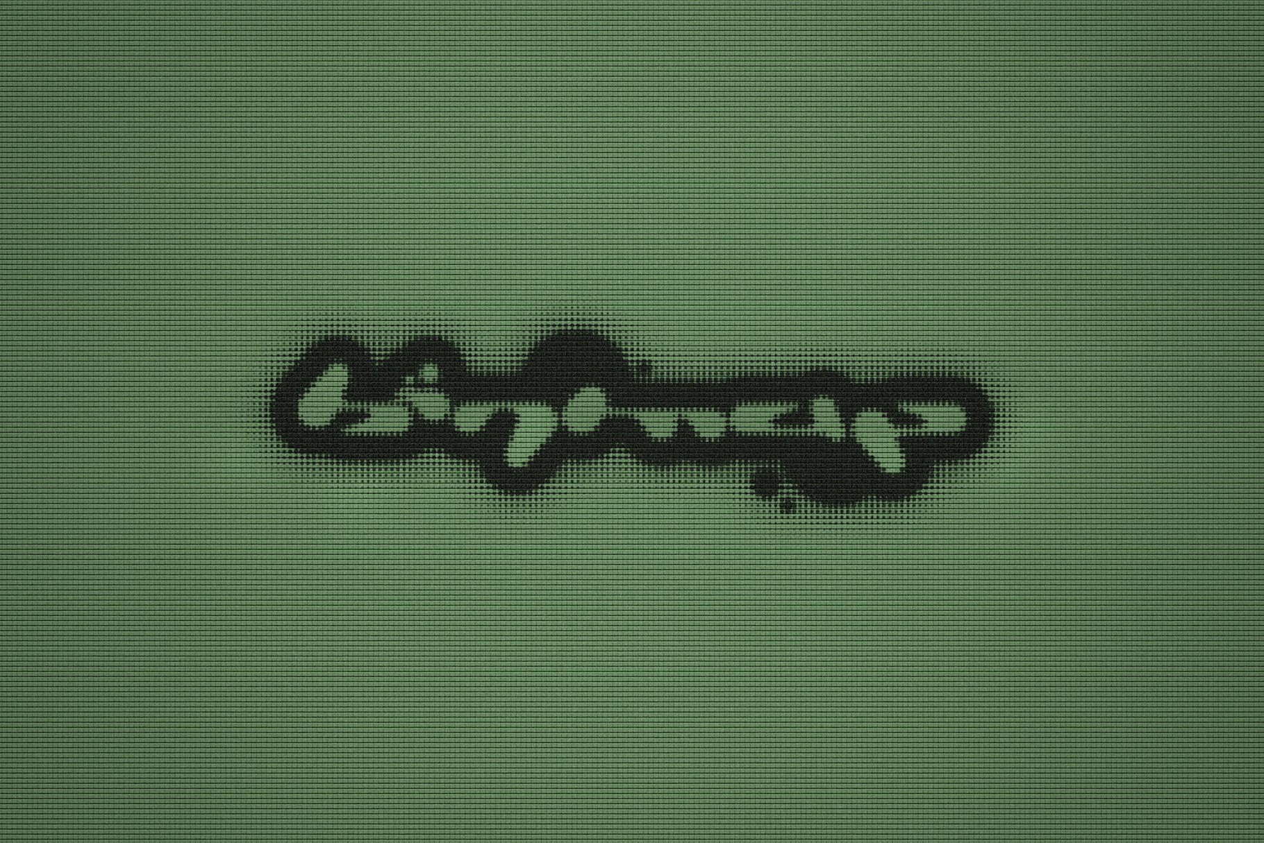
Naterium Retro-Modern Script Font | Image Source: Creative Market/Typetemp (25/04/25)
The Key Elements of Vintage Design
Pulling off vintage-inspired design is all about balance. You want it to feel intentional and artful—not like you're trying to recreate a lost ad from 1955. That means understanding the DNA of retro styles and choosing which elements to incorporate strategically.
Typography is your first big player. Serif fonts with high contrast, condensed sans-serifs with quirky ligatures, and script lettering can all evoke a retro vibe. But instead of using them across everything, mix them with modern layout structures or clean body text to keep things grounded.
Color plays a major role, too. Think muted reds, mustard yellows, avocado greens, dusty blues, and lots of cream or off-white tones. These shades scream retro but still play nicely in a modern setting when used sparingly or paired with neutral bases.
Textures and overlays—grain, noise, rough paper backgrounds, halftone patterns—can add just the right amount of vintage charm. These effects bring that analog warmth that’s missing from today’s slick, vector-heavy designs.
Layout and composition are also worth noting. Many vintage ads and posters used asymmetry, unexpected cropping, or grid systems that don’t follow today’s strict pixel-perfect standards. Playing with these elements can add a lot of character—just don’t go full chaos.

Tips for Blending Retro With Contemporary
If you’re feeling inspired to sprinkle some retro goodness into your next project, here are a few ways to do it effectively (and not make it look like a costume party for your design):
Start with intention. Don’t just add vintage elements because they look cool. Think about what the design is supposed to communicate. If your brand values include authenticity, warmth, or a sense of history, retro aesthetics might be a great match.
Use vintage as a spice, not the whole meal. A funky typeface or a grainy texture can go a long way. Pair it with clean modern elements to keep the balance right.
Choose your decade wisely. The 1920s Art Deco look is very different from 1970s psychedelia. Do a little visual research on what defines each era and pick one that matches your concept.
Stay consistent. If you're going vintage with typography, don’t clash it with ultra-modern UI elements. Consistency in tone makes the design feel cohesive rather than confusing.
Edit ruthlessly. It’s easy to overdo it. That’s part of the charm of vintage design—there’s a lot to play with. But trimming things down can help the retro accents shine instead of screaming.
Where to Find Resources
If you want to start experimenting with vintage design but don’t have time to dig through dusty archives, there are plenty of resources out there. Look for:
Fonts inspired by classic signage or print ephemera
Texture packs with halftones, grain, or scanned paper overlays
Mockups that feature vintage-inspired packaging or apparel
Color palettes pulled from vintage magazines, posters, or packaging
And if you want to skip the asset hunt altogether, I offer pre-made retro-inspired templates and graphics in my shop—perfect for brands that want a head start with authentic-looking vintage flair. (Everything is editable and beginner-friendly.)
Final Thoughts
Vintage design is more than a style—it’s a feeling. A sense of connection, of place, of personality. And when it’s done well, it doesn’t feel old—it feels timeless. By thoughtfully incorporating retro elements into modern design, you can create visuals that are both familiar and fresh.
If you’re ready to give your branding or creative project a vintage twist, I can help. I specialize in custom branding and design with character, and I’ve helped everyone from indie makers to established brands find the perfect balance between nostalgic charm and modern polish. Need a brand refresh or some visuals that pop with retro vibes? Let’s talk.