Understanding Design Psychology: How to Influence User Behavior
Design is not just about making things look pretty; it’s about creating experiences that guide users to act in specific ways. The secret sauce behind this is design psychology, a fascinating field that blends design with behavioral science to influence user interactions and decisions. Let's dive into some key psychological principles that designers can use to guide user behavior effectively.
The Power of First Impressions: First impressions are crucial in design. Within the first few seconds of landing on a webpage, users decide whether they’ll stay or bounce. This snap judgment is often based on visual appeal and ease of navigation. Think of your design as a first date: dress to impress, but don’t overdo it.
The Principle of Simplicity: Ever heard of Hick's Law? It states that the more choices you present to a user, the longer it will take them to make a decision. This is why simplicity in design is so important. Keep interfaces clean, with a clear path to desired actions. Remember, too many bells and whistles can confuse users. Think of it like a restaurant menu: a concise menu is less overwhelming than a book-length one.
The Fitts’s Law in Action: Fitts’s Law is all about the ease of clicking. It suggests that the time required to move to a target area (like a button) depends on the distance to and size of the target. Make sure essential buttons and links are big enough and placed where users can easily reach them. This principle is why "Submit" buttons are usually large and prominently placed, making them hard to miss.
The Magic of Color Psychology: Colors are more than just a pretty face; they evoke emotions and can influence decisions. Blue can convey trust, which is why many financial institutions use it. Red is attention-grabbing and often used for warnings or calls to action. Green is associated with success and is commonly seen in “Submit” buttons. Use color strategically to guide users and create the desired emotional response.
The Rule of Thirds: The Rule of Thirds is a principle borrowed from photography that can also apply to design. It suggests dividing a design into nine equal parts, using two equally spaced horizontal lines and two equally spaced vertical lines. Important elements should be placed along these lines or their intersections. This creates balance and draws the user’s eye to key parts of the design, much like a well-composed photograph.
Social Proof and Its Influence: Social proof is the idea that people will follow the actions of others. This is why testimonials, reviews, and user-generated content are so powerful. They show potential users that others have had positive experiences, making them more likely to engage. It’s like seeing a long line outside a restaurant – it must be good if so many people are willing to wait!
The Scarcity Principle: Scarcity can drive user action. When something is perceived as limited, it becomes more desirable. This principle is often used in e-commerce with phrases like “Only 3 left in stock!” or “Limited time offer.” The fear of missing out (FOMO) can be a powerful motivator.
Anchoring Effect: The anchoring effect refers to the human tendency to rely heavily on the first piece of information offered (the “anchor”) when making decisions. This is why pricing strategies often include a high initial price, which makes subsequent lower prices seem like a great deal. In design, use anchoring to highlight premium options before showing standard ones, making the latter appear more appealing.
Using Gestalt Principles: Gestalt principles focus on how people perceive visual elements as a whole rather than in parts. Concepts like proximity (grouping related items together), similarity (using similar design elements to create relationships), and closure (the mind filling in gaps) help create intuitive designs. These principles ensure users can quickly understand and navigate your interface.
Examples of Design Psychology in Action
Let’s look at some real-world examples where design psychology principles are applied:
Airbnb’s Booking Process: Airbnb uses simplicity and visual hierarchy to guide users through the booking process. The use of large, clear buttons and a clean layout makes it easy for users to complete bookings with minimal friction. Social proof is also prominently displayed through reviews and ratings.
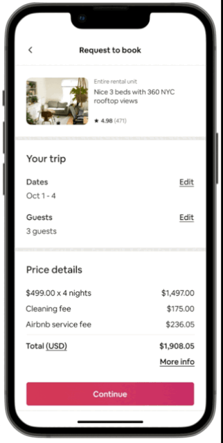
[UX Case Study] Airbnb: Improvement of Airbnb Booking UX Process by Hailey Kim via Medium | Image Source: ©Medium/Hailey Kim (21/06/24)
Duolingo’s Onboarding: Duolingo employs gamification to engage users. By setting small, achievable goals and using positive reinforcement (like sounds and animations), it keeps users motivated. The scarcity principle is subtly applied through streaks and daily goals, encouraging regular use.
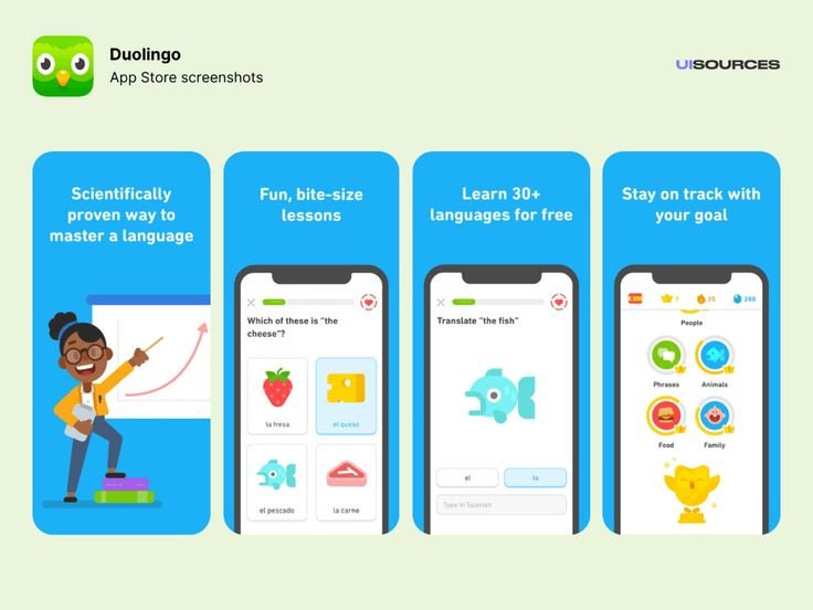
Duolingo UI/UX Design | Image Source: Pinterest/Google (21/06/24)
Amazon’s Product Pages: Amazon’s product pages are a masterclass in applying the scarcity principle and social proof. Limited stock alerts, user reviews, and recommendations based on browsing history all guide users toward making a purchase decision.
Understanding and applying design psychology can transform your projects from good to exceptional. By leveraging principles like simplicity, color psychology, social proof, and scarcity, you can create designs that not only look great but also influence user behavior in meaningful ways. So, next time you're working on a design, remember: it's not just about aesthetics—it's about how those aesthetics make users think, feel, and act. Need help applying these principles to your projects? Reach out, and let's create designs that captivate and convert!