A Guide to Designing Custom Icons
Icons may be small, but they carry a lot of weight in design. A well-crafted icon can communicate complex ideas in a fraction of a second, making them an essential part of branding, user interfaces, and digital experiences. Whether you’re creating icons for an app, a website, or a marketing campaign, custom icons ensure a unique visual identity that aligns perfectly with your brand. So, how do you create an icon set that is both functional and aesthetically pleasing? Let’s break it down step by step.
Step 1: Defining the Purpose and Style
Before diving into sketches or software, it’s crucial to establish the goal of your icon set. Are you designing icons for a corporate dashboard, an e-commerce store, or a playful mobile game? Each use case demands a different style—minimalist line art, bold geometric shapes, or hand-drawn illustrations. Additionally, consider consistency: will your icons be filled or outlined? Rounded or sharp-edged? These decisions lay the foundation for a cohesive set.
Step 2: Sketching Initial Concepts
Even in the digital age, sketching remains an invaluable tool. Grab a pen and paper (or a tablet) and quickly draft different variations of each icon idea. The goal here isn’t perfection but rather exploring multiple directions before committing to one. Think about clarity—each icon should be instantly recognizable, even at small sizes.
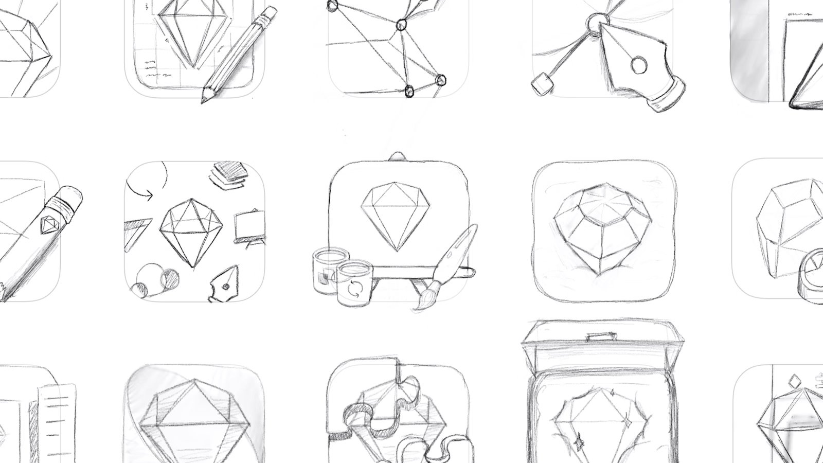
“Sketch” icon design process | Image Source: © 2025 Sketch B.V. (21/02/25)
Step 3: Choosing the Right Software
Once you have a solid set of sketches, it’s time to refine them digitally. Vector-based programs like Adobe Illustrator, Figma, or Affinity Designer are ideal for creating scalable icons that maintain quality at any size. Tools like the pen tool, shape builder, and pathfinder functions allow for precise adjustments and alignment.
Step 4: Designing with Consistency
Consistency is the secret ingredient of a professional-looking icon set. Set clear guidelines for stroke width, corner radius, and spacing. Use a grid system to ensure uniform proportions and alignment across all icons. If one icon has rounded corners, they all should. If you’re using a specific stroke weight, keep it the same throughout the set.

Step 5: Testing for Scalability
Icons need to be readable at different sizes, from a tiny 16x16px favicon to a large 512x512px app icon. Zoom in and out to check if the details remain clear. Overly intricate details may look great at a large size but turn into an unreadable mess when shrunk down. Simplification is key.
Step 6: Exporting in Multiple Formats
Once your icons are polished and finalized, export them in various formats to ensure compatibility across different platforms. Common formats include:
SVG (Scalable Vector Graphics) for web and UI design.
PNG for transparency support.
EPS or AI for print and high-resolution needs.
Step 7: Implementation and Feedback
Now that your icons are ready, integrate them into your project and see how they function in real-world applications. Get feedback from users, designers, or clients to identify any areas for improvement. Are they intuitive? Do they match the overall design language? Adjustments at this stage can refine the set even further.
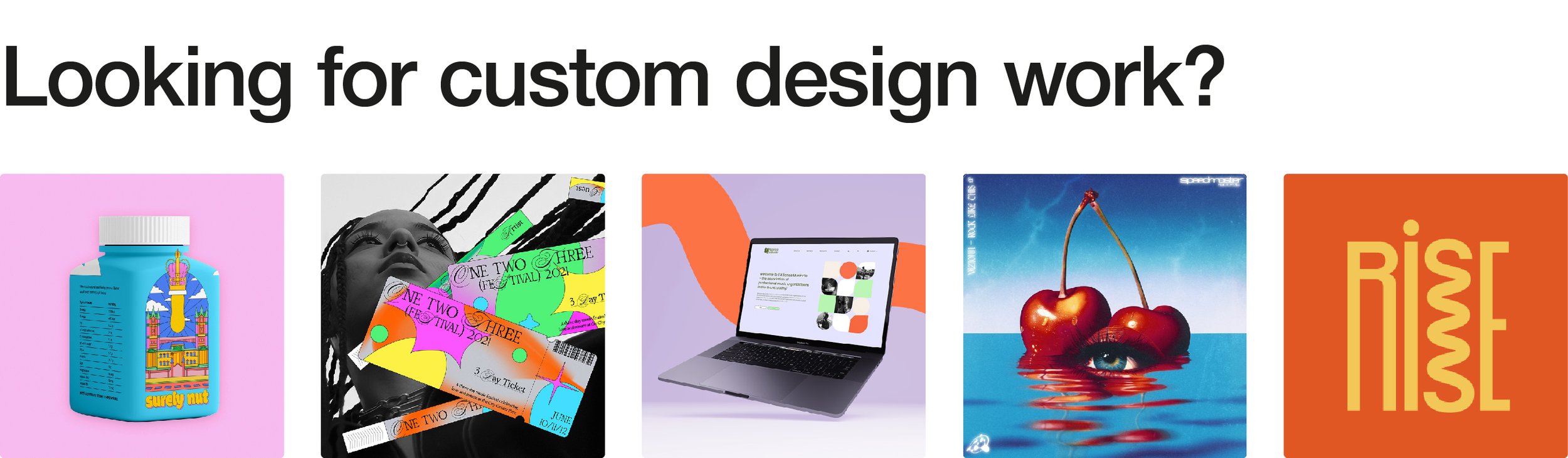
Creating Icons for Your Own Brand
Whether you're a seasoned designer or just starting out, custom icons can elevate your brand’s visual presence. If you want a unique, tailor-made icon set that perfectly fits your brand, I can help! I create fully custom icon sets designed specifically for your business, ensuring every detail aligns with your style and needs. Let’s bring your vision to life—get in touch to create something truly one-of-a-kind!