Flat Design: From Its Origins to Where It’s Headed Next
The world of graphic design is full of trends that come and go, but every once in a while, a movement emerges that truly changes the game. Enter flat design—a style that’s not just a fleeting trend but a transformative approach that has reshaped how we interact with digital interfaces. Let's dive into its evolution: from its minimalist origins to its current standing and potential future directions.
A Brief History: How Flat Design Took the Stage
Flat design didn't pop up overnight; it emerged as a reaction to the overly elaborate, skeuomorphic design trends of the early 2000s. Back then, interfaces were designed to mimic real-world textures and objects—think of leather-bound notes, shiny buttons with drop shadows, and detailed gradients to simulate depth. It was an attempt to make digital experiences feel more familiar.
However, as technology advanced, so did users. People no longer needed visual metaphors to understand digital interfaces. The rise of mobile devices with smaller screens also demanded a cleaner, more efficient design language. Enter flat design: a movement that stripped away the decorative fluff in favor of simplicity, bold colors, and clear typography.
Microsoft was one of the pioneers of this style with its Metro design system, introduced with Windows Phone in 2010. Shortly after, Apple—a company that once championed skeuomorphism—embraced flat design with its release of iOS 7 in 2013. The trend quickly took hold, and soon, it seemed like every brand was jumping on the flat design bandwagon.
Windows 8 Metro StartScreen | Image Source: © DESIGNBOTE (15/11/24)
Key Principles of Flat Design
Flat design is deceptively simple, but it adheres to a few key principles that set it apart:
Minimalism: No unnecessary elements—everything serves a purpose.
Bold, Vibrant Colors: Eye-catching palettes that draw attention without overwhelming.
Simple Typography: Clean, sans-serif fonts that are easy to read.
No Depth or Texture: The focus is on flat layers and 2D visuals, with minimal use of shadows or gradients.
Iconography and Illustrations: Vector-based icons and graphics that are easy to recognize.
These principles made flat design ideal for digital interfaces, especially on mobile devices, where screen space is limited. By reducing clutter, flat design emphasized usability, allowing users to focus on the content rather than being distracted by unnecessary embellishments.
The Present: Where Flat Design Stands Today
Flat design has matured since its early days. While its minimalistic roots remain, designers have realized that flat design, in its most extreme form, can sometimes feel too stark or sterile. This has led to the rise of a new style known as Flat 2.0 (or “semi-flat design”), which reintroduces subtle shadows, gradients, and layering to add depth without reverting to the excessive skeuomorphism of the past.
For instance, Google's Material Design is a perfect example of this evolution. It combines the simplicity of flat design with just enough depth to create a sense of hierarchy and structure. By using soft shadows, dynamic colors, and responsive animations, Material Design brings flat design to life while maintaining its core principles.
Google’s Material Design | Image Source: Material Design by Google (15/11/24)
Another current trend is the incorporation of neomorphism, which blends elements of flat and skeuomorphic design. It uses soft shadows and light sources to create buttons and cards that appear slightly raised or sunken, giving interfaces a tactile, almost 3D look. It's like flat design with a touch of dimension but without going full-on retro skeuomorphic.
Bank app concept in a skeuomorphist style by Mathis Freudenberger | Image Source: Dribbble/Mathis Freudenberger (15/11/24)
The Future of Flat Design: Where Do We Go From Here?
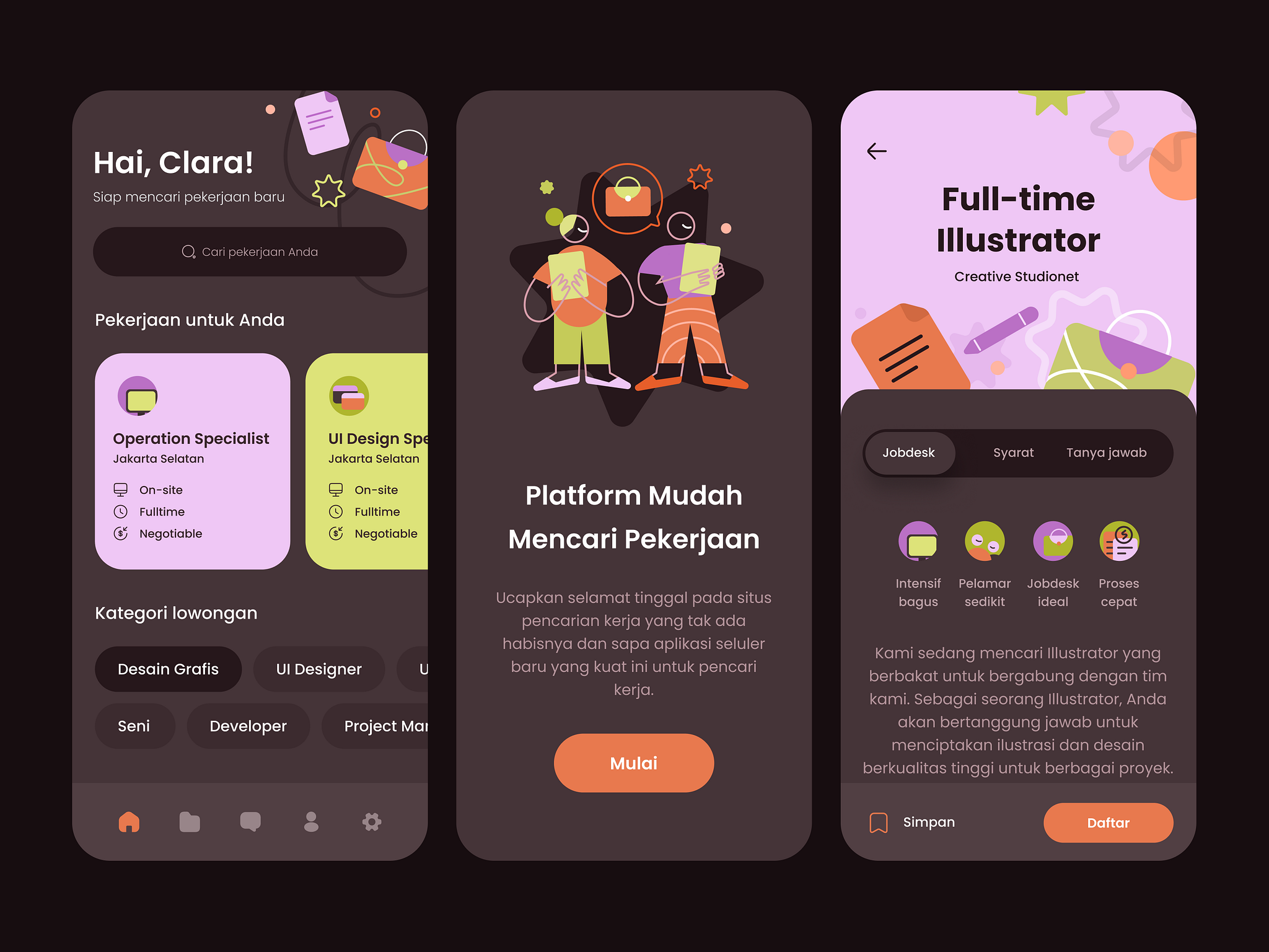
While flat design is here to stay, it’s continuously evolving. The next phase might involve a blend of styles to strike a balance between simplicity and depth. As we move toward more immersive technologies like AR (Augmented Reality) and VR (Virtual Reality), flat design will likely adapt to create intuitive, user-friendly experiences in these new digital spaces.
Sustainability might also become a focal point. With increasing awareness of eco-conscious design, we may see flat design embrace lighter graphics and optimized code to reduce energy consumption—a small but significant step toward a greener digital world.
Job Seekers App Exploration by Citra Paperpillar for Paperpillar | Image Source: Dribbble/Paperpillar (15/11/24)
But Why Should You Care?
Flat design is not just about aesthetics. It’s about user experience, efficiency, and brand identity. A well-executed flat design can make your brand feel modern, clean, and approachable. However, it’s important to recognize that while flat design offers clarity, it can also feel impersonal if not balanced with thoughtful details.
Ultimately, the best design is one that aligns with your brand’s goals and the needs of your audience. Whether you're designing a website, a mobile app, or even a business presentation, flat design offers a flexible, user-friendly framework that’s perfect for the digital age.
Looking for a Fresh Flat Design Approach?
If you're looking to breathe new life into your brand with clean, modern, and effective flat design, I’m here to help. As a one-woman graphic design studio, I bring a personalized touch to every project, combining creativity with strategy to ensure your brand stands out. Whether you're starting fresh or refining an existing look, let's work together to craft designs that are as unique as your business. Reach out, and let's turn your vision into reality!


